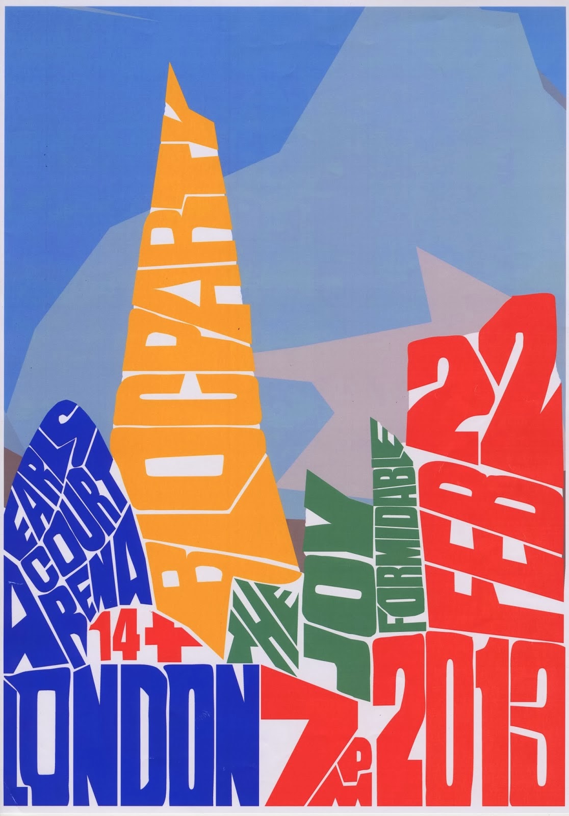
This is the final Bloc Party poster which I think suits the brief to make a decorative gig poster. I have used a similar technique to Oscar Wilson in the way that he forms letters around the object, in this case, London buildings.

|
| Some experiments with modular type done with pencil on gridded sheets as well as in Illustrator. The top left is made only drawing round a coin and a rectangular piece of card. I recreated some others using Illustrator with the intention of using them with in my book covers for sci-fi author, Philip K Dick. |

|
| The final hand drawn experiment into using a grid and shading in hexagons to create letters. |

|
This is a design which could be used as a cover for Philip K Dicks book, 'Do Androids Dream of Electric Sheep?' I was influenced by 'We Three Club' while creating this and their smoke like hand rendered text, as well as their grainy filters and dotted background which is also similar to some Psychedelic art of the 1960's. The aim of these filters and the style is to look like a silkscreen poster, which is how 'We Three Club' produce them.
Redesigned cover for the self titled 1970 Kraftwerk Album. This idea for the album was the four members of Kraftwerk and the different waves of a synthesizer, as the band is still known as one of the pioneering electronic bands.
You can see here that I had a stencil and then how I then used black spray paint to fill in the design.
The final poster for the fictional exhibition. I chose the hand holding the pencil to show a protest towards digital technology.
|

|
Thumbnails showing the initial ideas for my book covers which are going to act as an updates version of some of Philip K Dicks early books.
|

|
| These are some developments for my book covers using Photoshop and Illustrator. I have experimented with placement of the images, different colours and slightly different title layouts. I decided to go forward with the top left set of books as I thought they looked good as a unit while still suiting the sci-fi theme. |

|
| These are my final book covers, both front and back. I used Illustrator to create them. I based the covers purely on symbols from the book, often cryptic as Romek Marber did on his Penguin crime books that I studied. |
I created these posters by cutting out the letters and printing them manually (to achieve a letterpress/weathered effect). Then I imported the resulting print into Photoshop and used different effects and handmade backgrounds overlapped to create the main text.
Before I made these posters I had never heard of shark finning like most people; and wanted to create awareness to stop this cruel practice.
|